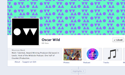
I've been experimenting with vinyl designs and made some interesting visuals. They're quite glitchy in appearance but it's appropriate to the electronic music scene. It fits in with how electronic music is made up of several elements. I like the juxtaposition of the shapes and the colours that sit harmoniously in the design. I put the imagery into the poster designs too but think i'll stick with the original designs in order to keep the clarity.
30.4.13
29.4.13
28.4.13
20.4.13
16.4.13
12.4.13
new colour scheme
After feedback and consideration I've decided to add colour to the designs as it fits in with the concept of visual sound. I think they work much better as the visual aesthetic is more appealing and conceptually fitting. The pantones i've gone for are:
green - c66m0y50k0
grey - c0m0y0k30
purple - c61m81y0k0
green - c66m0y50k0
grey - c0m0y0k30
purple - c61m81y0k0
11.4.13
10.4.13
copper
In order to draw people into the exhibition I've created a series of 3 posters, one of them being just image. That way it acts as a bit of a teaser making people curious to find out more. These are the designs I think I'll be going with as they work quite well in terms of composition and as a triptych.
5.4.13
Subscribe to:
Comments (Atom)


